 Zur deutschen Version Zur deutschen Version |
 |
G l o b a l c a r t o g r a m s |
 |
The Earth is not flat. When presenting maps on flat surfaces, projections are needed and distortion of shapes is unavoidable. Cartograms are maps where distortion of shapes is done to convey information. More precisely, polygons for which data is available are distorted in such a way that the areas of the distorted polygons are proportional to some characteristics of the polygon. For example, to visualize how much carbon dioxide is emitted by the countries of the Earth, the polygons of the outlines of all countries are distorted such that the distorted country polygon areas are proportional to the emissions. In the cartogram, the polygon of country A, with half the emissions of country B, has only half the size of the polygon of country B.
Cartograms can be used to represent two characteristics of polygons at the same time. For example, grid cells of size 0.5° longitude x 0.5° latitude, which is the spatial resolution many global hydrological models use, can be distorted according to the population living within the grid cells, while the color of the grid cells can represent the water resources within the grid cell. In such maps, regions with a large population are shown larger than less densely populated regions. As such a cartogram attracts the eye to regions where many people live, it is better suited than a normal thematic map to show water resources for people instead of water resources on land areas.
On this webpage, we provide a number of global cartograms related to water resources as well as climate change risks and responsibilities. With one exception they are based on output and input of the global hydrological model WaterGAP that calculates water resources and water use for all continents of the Earth (except Antarctica) with a spatial resolution of 0.5°x0.5°.
Cartograms and their descriptions for download
Water resources for humans
 |
Renewable water resources [mm/yr] (left) and per-capita renewable water resources [m³/(cap yr)] (right) for 1981-2010. Top: area-conserving equal-area Behrmann projections, bottom: cartograms with population in 2010 as distorter. Comparison of the normal maps with the cartograms shows that 1) people prefer to live where water resources are relatively large (left) and that 2) with normal maps water scarcity for people is underestimated (right). (Döll and Herbert 2018) |
Distribution of water and people
 Country polygons distorted
(top) by renewable groundwater resources 1981-2010 in 0.5° grid cells,
(center) by population in 0.5° grid cells in 2010 and
(bottom) by population in 0.5° grid cells in 2085.
According to the assumed growth of global population from 6.9 billion in 2010 to 9.9 billion in 2085, visualized total land area is 45% larger in the bottom than in the center map.
If the top and center maps looked the same, the renewable per-capita groundwater resources would be the same for all people around the world.
(Döll and Herbert 2018)
Future change of groundwater resources
 Potential change of
groundwater resources (top) and
per-capita groundwater resources (bottom)
from 2010 until the end of the 21st century due to climate change (emissions scenario RCP 8.5) and population change (population scenario SSP2). Ensemble mean of five WaterGAP runs driven by the output of five global climate models.
(Döll and Herbert 2018)
Components of climate change risk
 |
Cartogram set “Components of risk”: visualizing risks of CC due to a decrease of renewable groundwater resources by bivariate cartograms. Distorter variables are indicated in curly brackets. Visualization of only the hazard, in color, by a global equal-area map (a), the hazard being a decrease of groundwater resources by more than 10% between the periods 1971–2000 and 2070–2099 (ensemble mean of percent changes calculated by WaterGAP driven by five bias-adjusted climate models under RCP8.5). Visualization of hazard and exposure, by distorting 0.5° grid cells according to their population in the year 2010 (b) and hazard, exposure, and vulnerability, by distorting grid cells according to the population 2010 times a vulnerability indicator (c, d). In (c), the vulnerability index ranges between 1 and 5, while in (d), the same index is mapped onto the range between 1 and 21. Additionally, a zoom on western Europe and North Africa for the maps in (a)–(d) is provided in (e). (Döll 2017) |
Natural resources under stress
 |
Cartogram set “Natural resources under stress”: visualizing current and future per-capita renewable groundwater resources as affected by CC and population growth. Distorter variables are indicated in curly brackets. The left column shows per-capita groundwater resources, in m³/(cap yr), under current conditions (1971–2000, population in 2010) by a global equal-area map (a), and by a gridded cartogram with population in 2010 as distorter (b), and per-capita groundwater resources under future conditions as affected by climate and population change (2070–2099, population in 2085), with population in 2085 as distorter (c). The right column shows percent change of per-capita groundwater resources between current and future conditions due to both climate and population change (d), and due to CC only (e). Cartograms (c), (d), and (e) use population in 2085 according to SSP 2 for computation of per-capita groundwater resources in 2085 as distorter, and the total land area is enlarged by 45% as compared to maps (a) and (b), proportional to the increase of world population from 6.9 to 9.9 billion. Groundwater resources as computed by WaterGAP driven by five bias-adjusted climate models, high emissions scenario RCP 8.5. (Döll 2017) |
National Climate change responsibilities
 |
Cartogram set “National climate change responsibilities”: visualizing the relation between population numbers, CO2 emissions and wealth of countries by distorting country polygons by
The similarity of c and d visualizes that the wealth of most countries is based on their climate-damaging emissions since industrialization. It is these emissions and not the emissions in a particular year that are relevant for climate change (Döll 2017). Reference: Döll (2017) |
 |
Cartogram set “National climate change responsibilities”: visualizing the relation between population numbers, CO2 emissions and wealth of countries by distorting country polygons by
The similarity of c and d visualizes that the wealth of most countries is based on their climate-damaging emissions since industrialization. It is these emissions and not the emissions in a particular year that are relevant for climate change (Döll 2017). This cartogram set is an update of the corresponding cartogram set for the year 2010 described in Döll (2017). For the update to the year 2020, annual emissions for the years 2011-2020 (Crippa et al. 2021) were added to the cumulative emissions until 2010 of Döll (2017). Country data for population and gross domestic product for 2020 are, with few exceptions, based on a World Bank database (World Bank 2021). References |
How do cartograms work
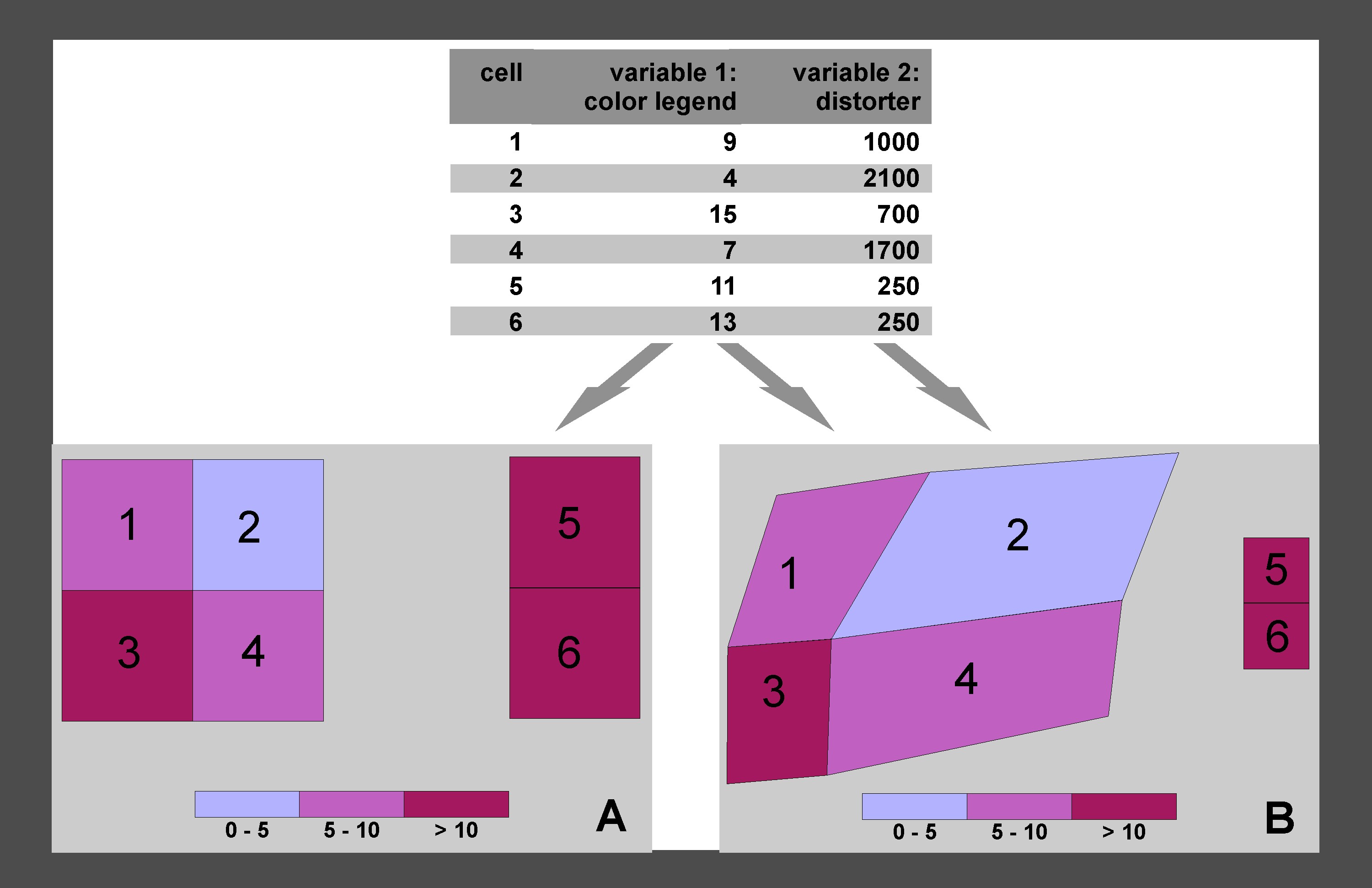 Schematic for representing information about spatial units by univariate thematic maps (map A) and bivariate cartograms (map B). While both maps represent variable 1 (e.g., per-cap CO2 emissions) by different colors, the bivariate cartogram additionally represents variable 2 by distorting the polygons of map A such that density of the distorter variable 2 (e.g., population per cartogram area) is the same in all distorted polygons.
(Döll 2017)
Publications on cartograms
Döll, P., Herbert, C. (2018): Wasserressourcen und Wasserknappheit: Visualisierung mit anamorphen Weltkarten. Geographische Rundschau, 1/2-2018, 44-50.
Döll, P. (2017): Cartograms facilitate communication of climate change risks and responsibilities. Earth’s Future, 5, 1182-1195. doi:10.1002/2017EF000677